

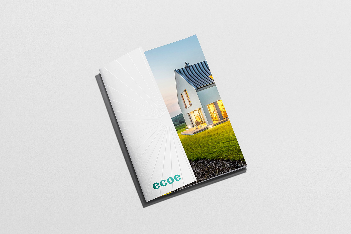
ecoe
Established in late 2019, ecoe is a platform for home buyers, renters, sellers, investors, and brokers based in Ho Chi Minh City, Vietnam, that provides home sellers an online platform combined with personal agent assistance to more easily put their houses, investors’ real estate on the market and get them sold.
The lifestyles of real estate agents, buyers, investors are changing. Everyone is looking for flexibility, immediate access to true information, and fewer middlemen.
ecoe presents the all-in-one platform by constantly collecting, inspecting, and evaluating to empower you with unparalleled data and connect you with the right professionals, bring out the true values you deserve from your property.
Our Scope
Brand Audit, Brand Strategy, Brand Messaging, Brand Identity, Print Materials, Motion Graphics,
Brand Website, Brand Guidelines

Story of
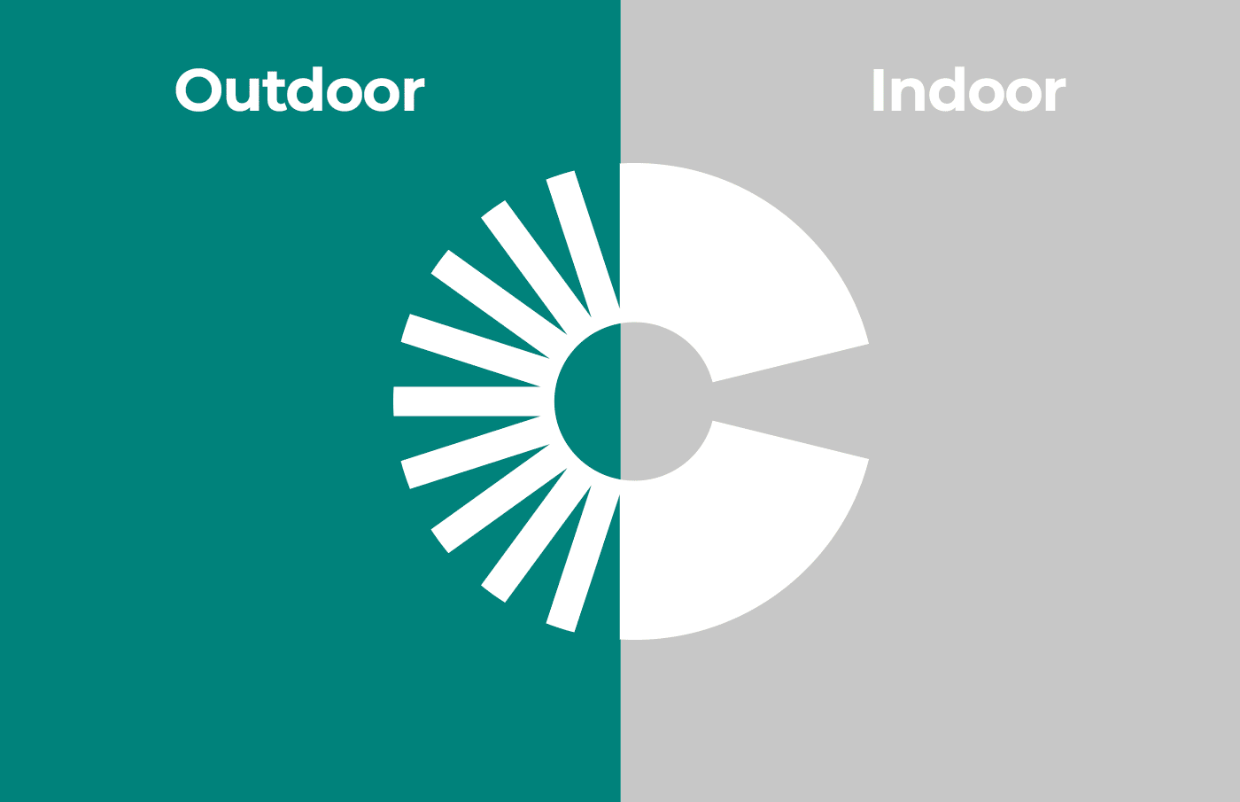
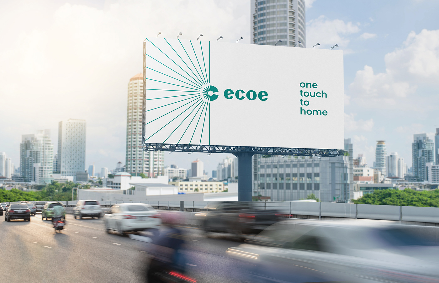
Indoor & outdoor
Challenge
Ecoe had the ambition to deepen technology to reshape real estate, demonstrate that ecoe was categorically different, drive the business forward, and bring out the true values to property and homebuyers.
The challenge was to transform what makes ecoe special, set it apart from the competition, and make people love it and connect.
It's the purpose of driving ecoe and visual identity to become a destination - investors, agents, buyers, sellers, renters, and brokers.
The identity had to stand out in a crowded market, communicate freshness, creativity, energy.
Flexible but unified, functional, but friendly. Doing so would help win backers in challenging markets.

Approach
Ecoe had the ambition to deepen technology to reshape real estate, demonstrate that ecoe was categorically different, drive the business forward, and bring out the true values to property and homebuyers.
The challenge was to transform what makes ecoe special, set it apart from the competition, and make people love it and connect.
It’s the purpose of driving ecoe and visual identity to become a destination - Buyers, sellers, renters, brokers, agents, and investors.
The identity had to stand out in a crowded market, communicate freshness, creativity, energy.
Flexible but unified, functional, but friendly. Doing so would help win backers in challenging markets.


Strategy
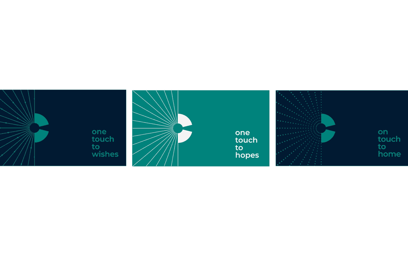
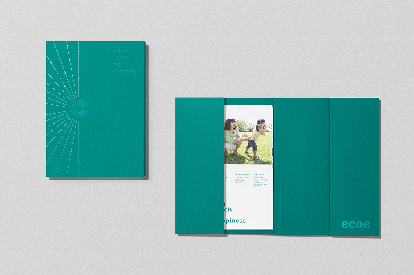
We defined a purposeful brand concept: Indoor and outdoor. It speaks to ecoe purpose of help find the place people want to live, giving them the power of technology over their data, and connect to brokers. ‘One touch to home” it’s the promise driving ecoe to become your destination - the destination of investors, agents, buyers, sellers, and renters.
This became the foundation for everything that followed.
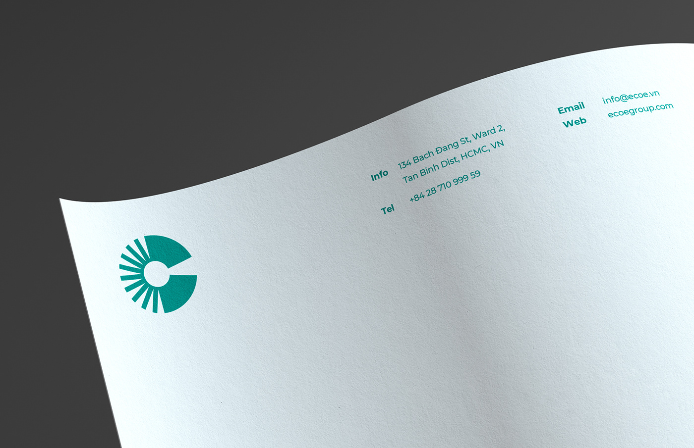
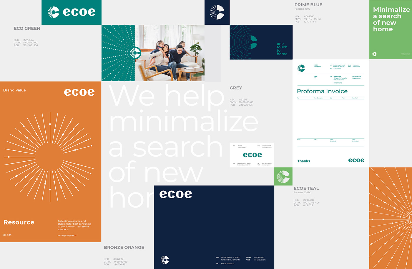
ecoe logotype has bold and classic type proportions and is derived from a modern geometric font. It feels contemporary yet timeless by giving thorough attention to each custom detail.
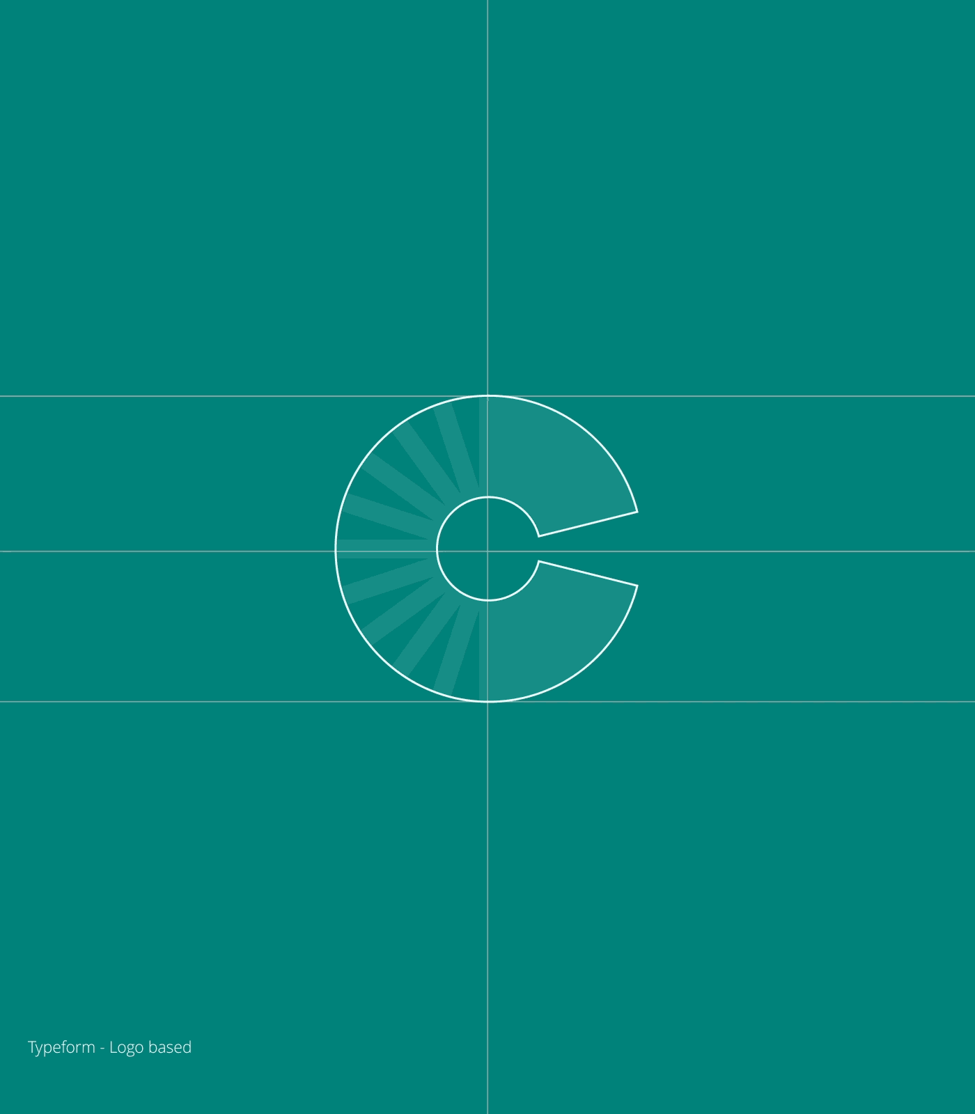

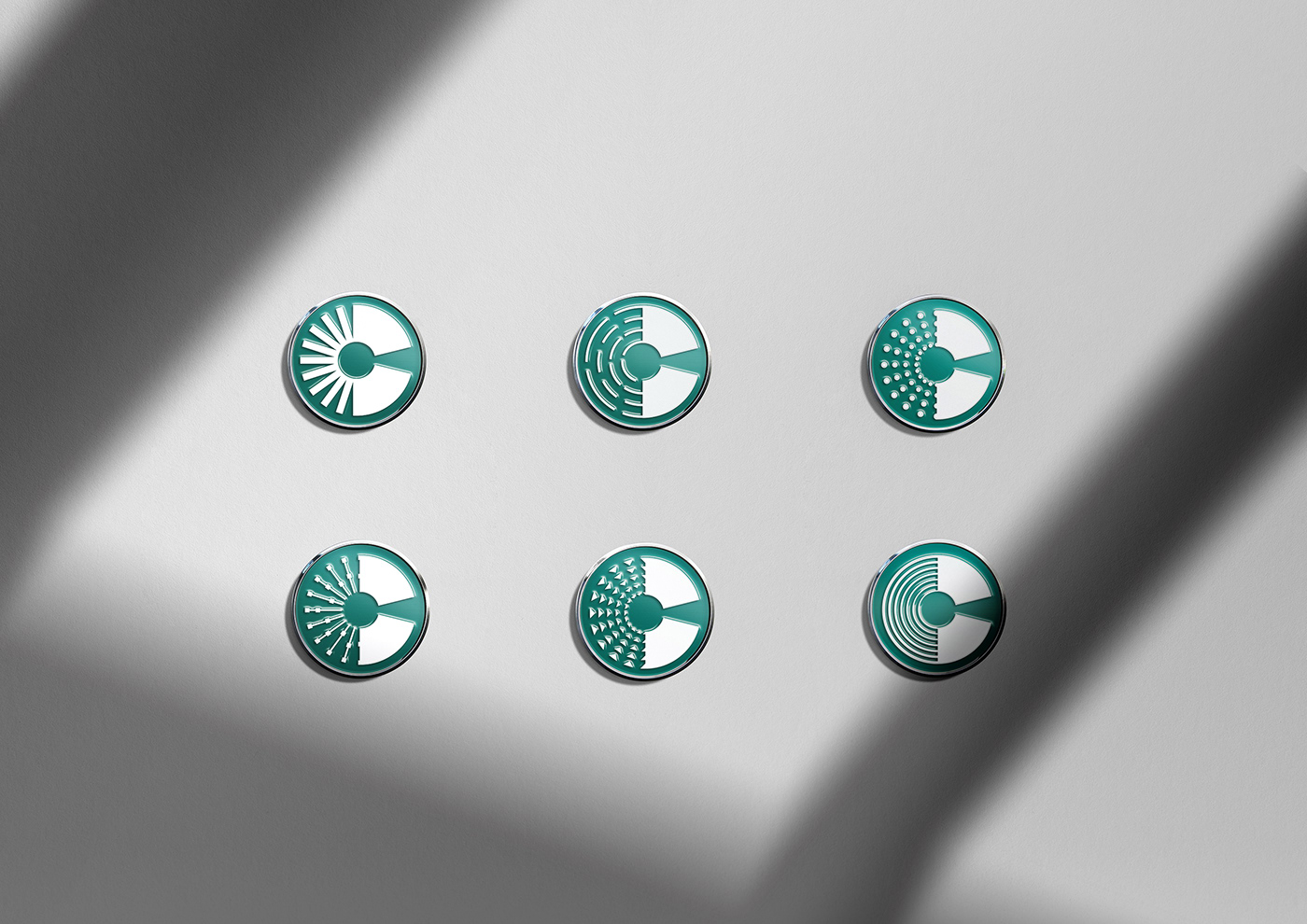
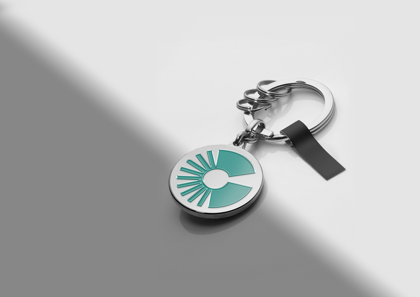
Design system / Logo concept
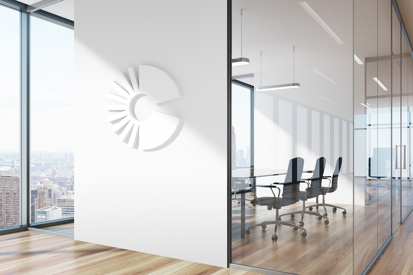
At the heart of the brand identity is a dynamic logo. We underscored the
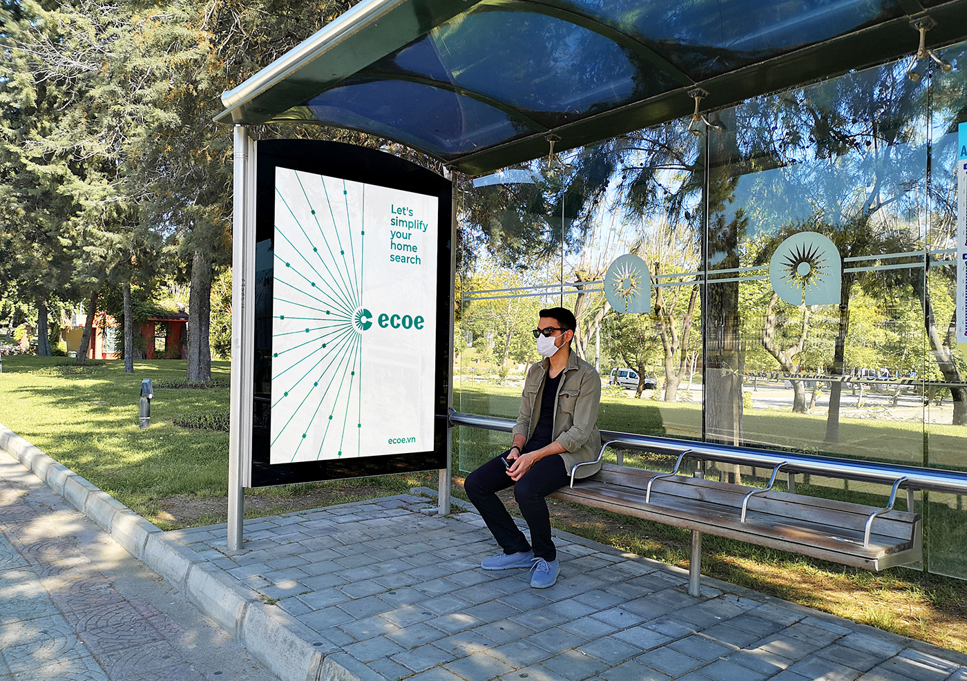
letter mark “e” by an abstract geometric symbol of the lock that represents the smart search tool to simplify your home search.
letter mark “e” by an abstract geometric symbol of the lock that represents the smart search tool to simplify your home search.
Moreover, it is an information filtering system to collects, inspects, and evaluates
data for users.
The concept boosts the tone of voice principles for ecoe to communicate their confidence, friendly, optimistic further and distill it into a simple, memorable, and powerful expression both for ourselves and our consumers.
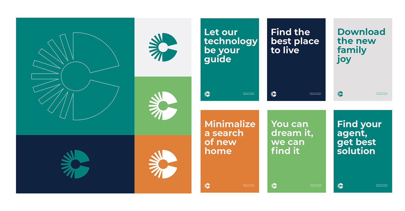

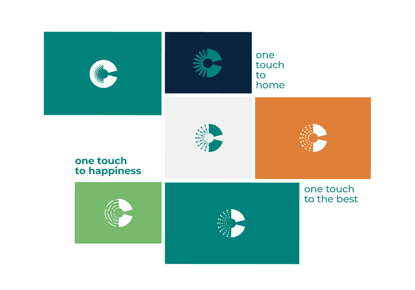
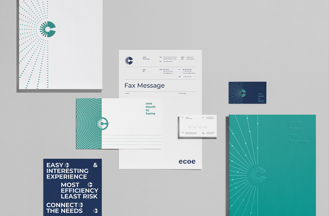
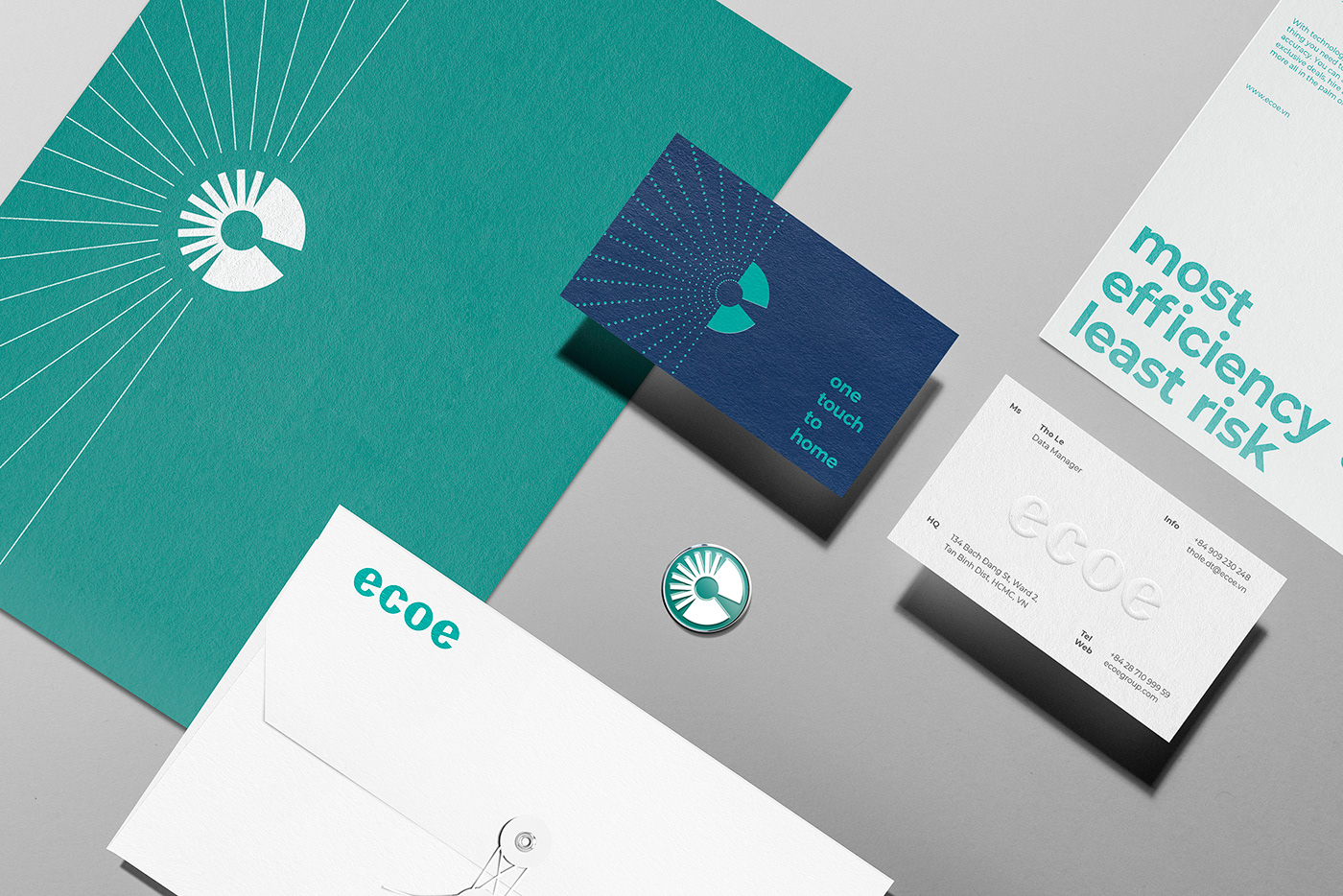
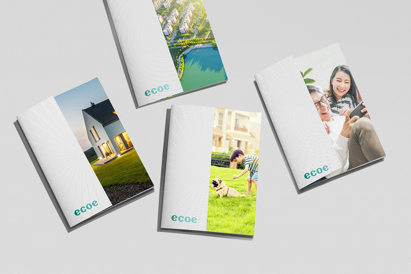
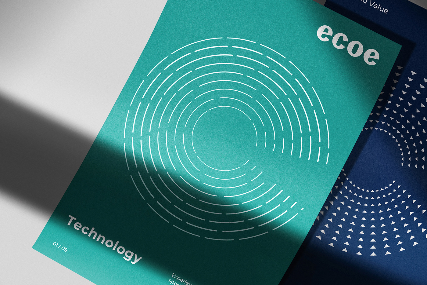
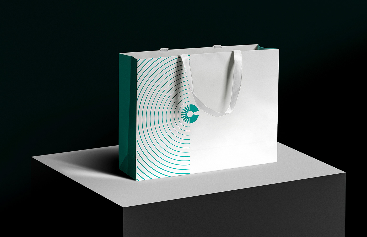
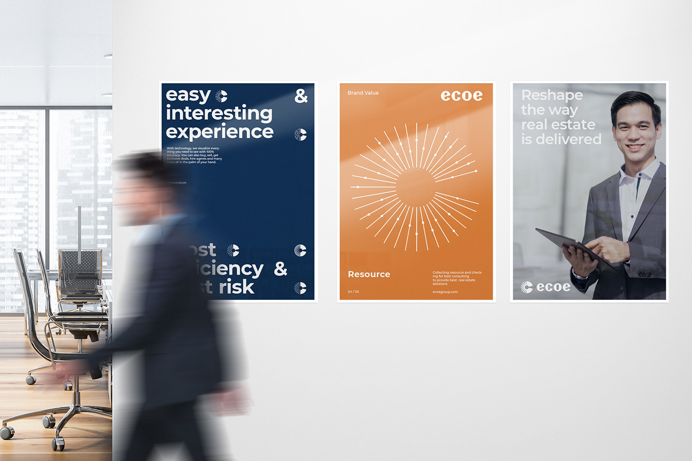
We designed a flexible identity representing the evolution of technology and translated brand values into geometric patterns.
Within each symbol and pattern is subtle meaning and connotation of search, connection, technology, resource, definition and apply on central to design system, we created a layout visuals flexible in stationery, marketing collateral and also animation visuals in digital representing the evolution of technology and brand values.
Within each symbol and pattern is subtle meaning and connotation of search, connection, technology, resource, definition and apply on central to design system, we created a layout visuals flexible in stationery, marketing collateral and also animation visuals in digital representing the evolution of technology and brand values.
Collectively, they represent agents, brokers, users, and markets that work as one to redefine real estate in the customer’s favor, help find their dream home. The transformation is return results “One touch to home” with place people want to live.

The identity represents this diversity of dwellings, environments, and amenities with a comprehensive set of icons from highly functional to ultra expressive.
The logo and visual system patterns interact in motion, solidifying what ecoe is all about.
The logo and visual system patterns interact in motion, solidifying what ecoe is all about.
By developing visually dynamic, from expressive to functional, we build the business strategic connect to the brand and brand connecting to people.
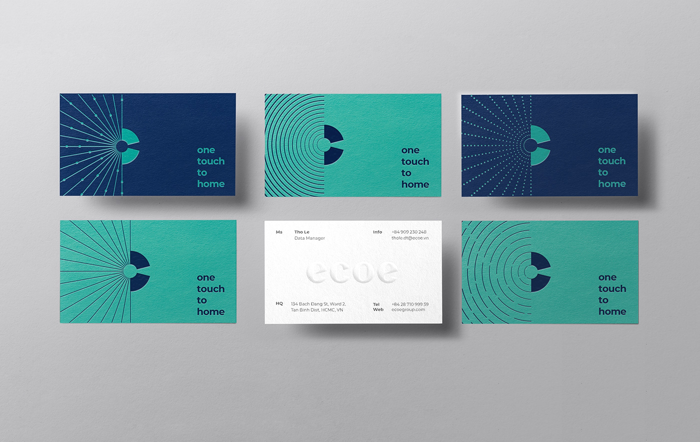
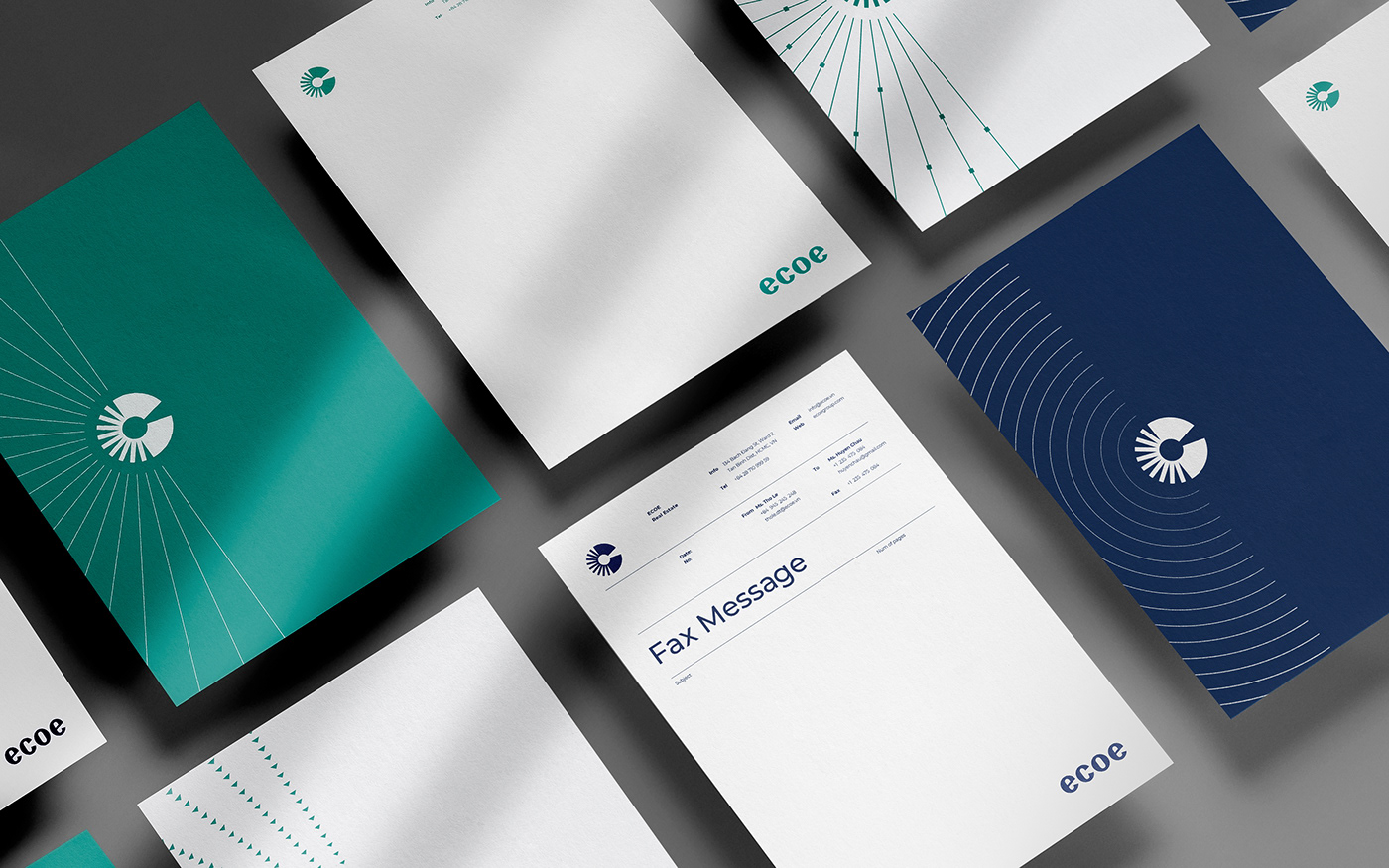

Indoor & outdoor are together in unique compositions layout. The suite of pattern elements is used as a tool for storytelling to shape value and message, and promise.


Our concept is Indoor and outdoor. Inspired not only our symbol and key visual identity but also its meaning.
We know that finding a home is like finding the other half of life, ecoe, to help find the place people want to live. An identity stands for optimism about the future.
We know that finding a home is like finding the other half of life, ecoe, to help find the place people want to live. An identity stands for optimism about the future.

Results
By developing visually dynamic, from expressive to functional, we build the business strategic connect to the brand and brand connecting to people.
Indoor & outdoor are together in unique compositions layout. The suite of pattern elements is used as a tool for storytelling to shape value, message, and promise.
Overall, the brand is energetic, and identity has enabled Emergence to differentiate itself from launching day, providing confidence. It’s the purpose driving ecoe to become your destination - the destination of investors, agents, buyers, sellers, and renters.

Credits
Client: Ecoe
Branding Agency: Bratus
Brand Strategy/Creative Director: Jimmi Tuan
Senior Designer: Si Tran, Nguyen X. Hoang, Trang Pham, Alex Dang
Motion Designer: Si Tran
Account Director: Quyen Tran
Project Manager: Hien Nguyen


